Webshop & booking platform redesign
Amepheas AG · 2025 · UX/UI Design
Scope
E-commerce · Booking flow · Content structure
Tools
Figma · Illustrator
Focus
Simplifying navigation, improving booking flow, and reducing visual complexity
Intro
In early 2025, I redesigned the Amepheas webshop to improve clarity, usability, and booking efficiency.
The previous experience was functional but visually dense, with long text blocks, repetitive sections, and a weak hierarchy that made navigation and decision-making harder.
The redesign focused on simplifying the interface, strengthening visual structure, and integrating a more intuitive booking flow for both German and English-speaking users.
Context & challenge
The Amepheas webshop combines product browsing with booking-based interactions, requiring users to both explore content and complete actions such as selecting tickets or scheduling visits.
The main challenge was to simplify this dual experience:
Reduce visual overload without losing important information
Make booking actions more immediate and visible
Ensure clarity across multilingual content
From cluttered to structured experience
The original webshop relied heavily on long text sections and repeated content blocks, making it difficult for users to quickly scan and find relevant actions.
The first iteration focused on reducing visual noise by introducing more whitespace and clearer grouping of elements.
The final design established a consistent layout system, improved hierarchy, and integrated booking components directly into the browsing experience
The final design integrates booking directly into the interface and introduces a clearer visual hierarchy. The first iteration reduces visual noise and improves content grouping. The original design is visually dense, with repetitive elements and a weaker structure.
Core interaction: booking flow
A key improvement was the integration of a direct booking calendar within the interface.
Instead of separating browsing and booking into different steps, the new design allows users to:
Explore products or events
Select dates directly within the same flow
Complete actions with fewer steps
This significantly reduces friction and improves task completion.
The redesigned experience introduces a calendar-based interaction, allowing users to select dates and view events in context. Previously, navigation relied on long lists across multiple dates, making the booking process slower and less intuitive.
My role & contributions
UX/UI redesign of the webshop in Figma
Simplification of layout and structure
Definition of visual hierarchy for better scannability
Optimization of content presentation
Design of custom icons in Illustrator to support navigation
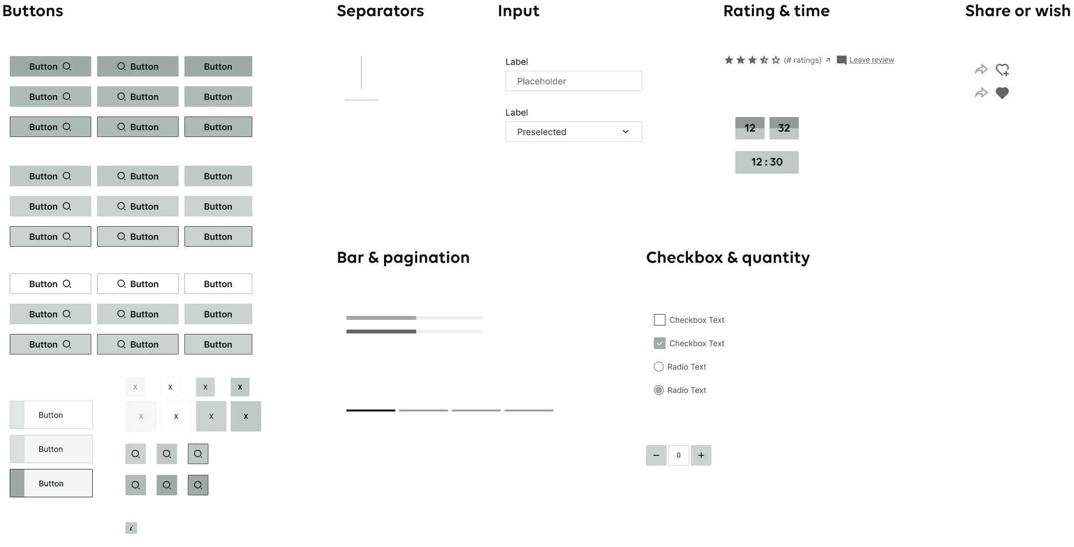
Visual system
To ensure visual consistency across the platform, a lightweight design system was created, including:
Custom icon set for navigation and categorization
Button and input components for booking interactions
Typography and color styles to reinforce hierarchy
This ensured a cohesive experience across desktop and mobile.
Icons
Small elements
Key improvements
Navigation → clearer categories supported by icons
Booking flow → integrated calendar with fewer steps
Visual hierarchy → reduced text, stronger call-to-actions
Multilingual experience → consistent German and English content
Outcome & learnings
This project reinforced the importance of balancing simplicity with functionality in e-commerce design.
Reducing visual complexity does not mean removing content, but structuring it in a way that supports user decisions.
Designing around real user actions, such as booking, proved more effective than focusing only on visual improvements.