UX for visitors, not users
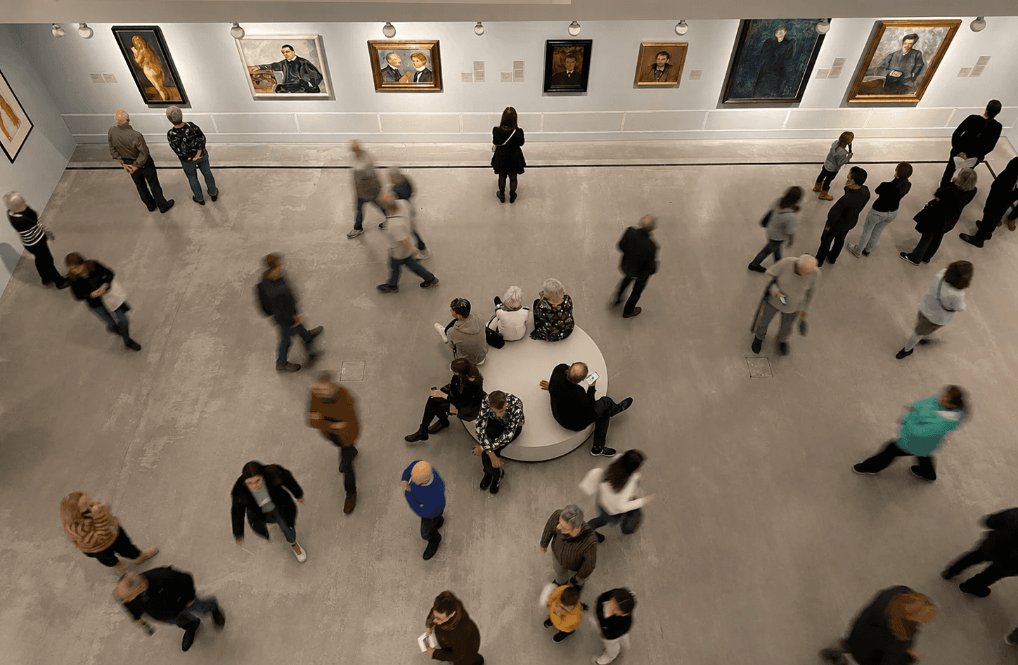
Most UX principles are built around focused attention. But cultural spaces rarely work that way. Museums are full of movement, noise, distractions and constantly shifting attention. People stop unexpectedly, skip instructions, get lost, walk too fast or too slowly, and often interact with interfaces only for a few seconds at a time.
Before working on museum experiences, I thought mainly in terms of screens, flows and interfaces. But designing for cultural spaces slowly changed the way I understand UX altogether.
Visitors are not the same as users.
They are walking, getting distracted, talking to other people, looking at artworks, trying to orient themselves in unfamiliar spaces or simply feeling tired after hours of moving through exhibitions. Their attention is fragmented, and the interface is rarely the center of their experience.
One of the first times I truly noticed this shift was while working on accessibility-related tasks for the Berlinische Galerie media guide. My contribution focused mainly on iconography for light and dark modes, but the project exposed me to a way of thinking that prioritized clarity, readability and adaptability over visual expression alone.
The interface wasn't supposed to demand attention. It was supposed to quietly support the visitor.
Later, during an installation at Völklinger Hütte, this idea became even more tangible. I worked on the placement of trigger points connected to points of interest throughout the exhibition space. The positioning had to be extremely precise. If two trigger areas overlapped too much, the next audio would activate before the previous one had finished, interrupting the experience entirely.
What made this particularly interesting was that the UX problem wasn't happening on a screen.
It existed in physical space.
A few centimeters could completely change the pacing of the experience. The distance between points, the walking speed of visitors and the direction people approached from all affected whether the interaction felt natural or frustrating.
That experience stayed with me because it revealed something I hadn't fully understood before: good UX in cultural spaces is often invisible.
It doesn't try to compete with the architecture, the artworks or the environment itself. Instead, it creates enough clarity for people to move through the experience without constantly thinking about the system behind it.
The interface is rarely the main experience. The space is, and the interface is just a tool.